Image Slider

9.25.2013

Freshen up your living space with pillows....


My client wanted a more neutral collection of pillows
for her family room sectional sofa and two chairs.....
Sectionals can be tricky - how many too pillows is too many?
I like to 'mostly' match the arm ends - as you can see I have the same two 
selected with the small leopard thrown in on the left-side for 
some fun!  In the center I selected the large Mongolian Lamb
pillow from West Elm to pair with a sweater pillow the
client had found at Homegoods!  I think this is a great mix
of pattern and texture for a relatively good value.
The splurge in the mix is the Schumacher
Betwixt bolsters for the two chairs in the room.
I couldn't help myself - it's a favorite!

Have a wonderful day!


9.22.2013

Blogging and the Emmy's Red Carpet.......


Blogging definitely took a backseat to my planking project this week - see the above
Instagram photo I took yesterday.  Don't let this photo fool you - the project is
far from done - painting and caulking still need to be completed and I would
love to paint the ceiling and replace the pot lights with cute fixtures.......
What I have learned is this - I have no future in adding DIY projects 
to this blog - I will stick with posts focused on decorating and
design, period, end of story.

But in all seriousness, I love how my formerly, very boring hallway with SIX
doors is looking!  This photo was actually taken from the place I
stand in my kitchen, like 6 hours a day it seems.  It's the small
things, like looking down at my planked walls, that make me very happy!
So done or not, I am thrilled!

As I write this I am watching E! Live from the Red Carpet - it's 
my favorite part of the whole award show thing.  I almost never
watch the award show itself, is that weird?  

And finally - the long awaited winner of the LoveFeast giveaway is........
commenter #11 {as chosen by my 11 year old}......

Ashley

**Check your email!


9.18.2013

Love Feast Giveaway!


LoveFeast is a sweet online shop with lots of wonderful
 home decor products including these these darling 
velvet pumpkins. Each velvet pumpkin includes a real pumpkin stem so they
look completely organic and so lovely incorporated into your fall decor!

You can check out all their products HERE.

LoveFeast has generously offered to giveaway a trio of the 
velvet pumpkins pictured above to one lucky
Forever*Cottage reader!

To enter, leave a comment telling me what 
you love best about fall, it's as simple as that!

You have until Friday at midnight PST to enter!

Thanks LoveFeast shop for your sponsorship!
9.16.2013

Advice for Monday.....

This will be my mantra this week, cause it's a big
photo shoot week - super exciting for me!
I can't wait to tell you more about it.
xo~

9.12.2013

Client project, an updated study......

I learned an important lesson when I began
doing this post - I must take more 'before' photos
of the spaces I work on.....

I have just ONE pathetic photo of the study that I worked on for 
a client/friend.  The space is just off the entry of the home,
has a sort of craftsman/mission style vibe and is used by the
family for studying, working and reading. All the 
furniture and the rug had to stay.  What needed to
go was the orangey/red-ish walls.  The painting below
was purchased by the homeowner in Thailand and
was the inspiration behind the new and improved space.

the ONE and only 'before' photo

Below is the design board I did for the client - I loved
the idea of using grasscloth on the walls and was thrilled
when the client did too!  As you will see below - grasscloth
{done in an earthy green} is really the show-stopper in this space!

***********************************


And here is the updated space!


Obviously, I started with a great space already - the desk was
the homeowners grandfather's that they incorporated into the 
built-ins when they built the home, love that!  The client
wanted the rug to stay and of course, that painting is 
really a great focal point above the fireplace.


We updated the space with fretwork lampshades {from Target!}, the 
fun ikat pillow from Ballard Designs and accessories from 
Homegoods, Shop Furbish and Wayfair - some of my
favorite go-to's for finishing a space!


And I am not going to take credit for styling the 
bookcases - my talented client did that all by herself,
along with the gallery wall.


My client/friend has a stationary business called Paper Moon,
so it is fitting that she has the sweet paper wreaths
on the doors leading into the room.


If you would like my help creating a space you love,
email me at jill.hinsondesigns@gmail.com.

 THANKS to my client who trusted me, believed in the design
plan and executed it beautifully!

9.11.2013

Reality.......


Indeed!

Happy hump day!

9.10.2013

Jamie Shops!


Today I want to highlight a relatively new sponsor of my blog

Jamieshop.com is a online buying service for 'to the trade' only
interior design elements - think the fabrics, lighting and accessories that
you drool over in Elle Decor, Architectural Digest and House Beautiful!

The brainchild of nationally renowned interior designer, Jaime Herzlinger, 
the service allows regular folks like us access to beautiful fabrics
without having to work with an interior designer.  Using a buying service
allows you to avoid the designer mark-up and time billed that most 
interior designers charge for sourcing.

Jamieshop.com is an easy to navigate site that allows you
to search manufacturers and request price quotes right online - 
super convenient!

Go check it out and let me know what you think!
9.07.2013

D.i.y. dilemmas....


I had hoped to share a d.i.y. project with you all this week.....
a sort of "hey, look at me with my kids all back in
school, clients taken care of, laundry done AND 
my walls freshly planked".  It was going to be EPIC,
cause, let's face it.....around here at the Forever*Cottage you get
a lot of decorating but not much d.i.y. - I leave that to 
other bloggers who are far better at it than me......Hey,
I don't even know if officially I need to put periods between
d.i.y. or do I just say diy, which my Mac does not
like and tries to tell me is a misspelled word.

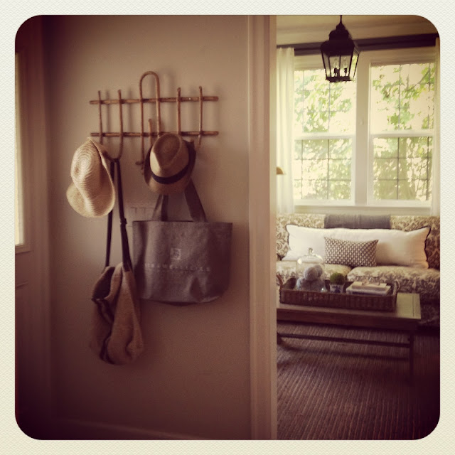
But instead I am sharing a photo of my new/vintage French
hat rack that I finally got around to hanging in my entry....
which by the way is looking better these days.....

And take a guess what I am doing this weekend?

That's right, finishing my d.i.y. planking project.....
cause nothing ever goes as planned.....that's what
all you expert d.i.y.-ers would tell me, huh?

Oh, and I have an entire soccer team and their
parents coming over for a meeting/dinner tomorrow
night......better get planking {so much better than twerking right?}.....
{sorry I couldn't resist}

9.05.2013

Styling bookshelves.....

Well hello..............
Are we all back-to-school coffee'd out? Are the little darlings
happily immersed in their schedules, routines, lessons, practices,
etc....?  I feel like this year has been a whole new chapter in our back-to-school,
with a high school freshman and a very independent middle schooler it's as
if I am hardly needed and eh, I skip the back-to-school coffee's - it's official
I.AM.THAT.OLD.MOM.   But that's a whole different post....today
we are going to talk about book shelf styling.

My design business really kept me busy this summer - which
was awesome!  {Awesome, but quite the juggle with kids home.}
I worked with many of you via email, which is super fun but I
also worked with many local clients on fluffing and feathering
their nests LIVE and in PERSON - which is great but also means I have
to get showered and dressed!  

Let's just say,it was the summer of bookshelves - styling that is!

What I have discovered is you all are afraid of the bookshelf -
and I am here to tell you, don't be afraid of the bookself!
Bookshelves are there to let your personality and collections
shine in your home!


The photos above and below are from my Pinterest board "Shelves and Vignettes" -
both are beautiful examples of well styled bookshelves {in my humble opinion}.
I love that they include books {duh!}, and collections, art, organic materials,
boxes, frames and quirky items too!


I am working with an eDesign client on bookshelf styling - which can
be tricky, what I wouldn't give for cheap airline tickets and be able to show
up on your door step sort of like Publisher's Clearinghouse Giveaway but
without the big check and balloons but with lots of fun stuff to style
your bookshelves like nobody's business.

But since I haven't gotten the call from Delta Airlines
to sponsor my eDesign business, a design board
and a detailed email had to suffice.


Above is the design board I quickly put together that represented
some of my favorite bookshelf styling items. 


And this photo is of a recently styled bookshelf in a client's home using
items the client already had!


And above is my bookshelves in my great room - about 4 bookshelf stylings ago!
{I might have a problem!}


And finally, the photo above is also from a client project - pay no attention to 
the upper left corner - needs something, huh?  Well I am posting this photo
to demonstrate how important balance is.  I actually broke the 
client's daughter's clay figure that we were going to include 
in the book shelf - YES, I did!  Well, good thing for me we were able
to glue the masterpiece back together, but it needed to dry so therefore was
not photo-ready in time for this picture.  

The moral of today's story......if you are local, I will come dressed
and showered and ready to style your bookcases.....however,
I may break your precious child's clay masterpiece......

And to Delta Airlines....call me, maybe?


Follow this blog with bloglovin

Follow on Bloglovin
Related Posts Plugin for WordPress, Blogger...