Image Slider

10.28.2012

A client before/after.....lighten and brighten!


My clients for this project were friends of ours when we had our
first babies {years ago!}.... we had been out of touch when Maria contacted
me via Facebook and asked if I knew of a good interior designer.

Of course, I suggested......me!

The house is an updated 1960's ranch with a lower walkout level.  I would say
the updates lean towards a cottage look.  The large 'great room' pictured
above was being used as a family gathering space but the awkward layout and 
furniture from a previous house did not make for a space that the family
really loved to spend time in.  Additionally, the clients wanted to add
a dining space in the layout.

As you can see the room provided me many challenges - the large set of french doors 
centered in the room, the half wall that supports the stairs to the lower level and what you 
can barely see in the pictures.....a REALLY unattractive fireplace, basically a painted
stucco'ed box.

The client's goals were simple - lighten and brighten.  Like so many
homeowners, my clients were tired of the red and yellow color
scheme and wanted to update with a coastal {he's Hawaiian!}, contemporary
vibe.  More importantly, they wanted a space that would be a 
comfortable space to hang out with family and friends.


 Here is the new and improved space!


We defined the living space with a soft area rug - perfect for kids to sit on the floor! While
the client initially thought a sectional would work well in the space, we opted for two sofa's 
instead.  Two sofa's provide more flexibility and believe it or not, often more seating! We
replaced the french door curtains with simple white panels hung almost to
the ceiling.


I designed built-in bookshelves and fireplace surround - providing a 
great focal point for the living space and much needed storage
for the family's books and games!


The new room has two fabulous custom furniture pieces - a dining table
made from reclaimed wood and an industrial-inspired coffee
table made from metal pipe and reclaimed wood.  Both pieces
were made for me by Tarte.  

We used contemporary dining chairs - I love
the juxtaposition of the farm table with the 
sleek chairs!


While this was a significant project - budget was a big consideration.
The chair pictured below is one the client's had {pictured in the 
'before photos'}, we simply had a new slipcover made in an
updated fabric.  The large round table between the 
sofas is the client's Craigslist find!


I had a blast installing a family gallery wall 
in the dining space.


The clients had meaningful pieces of art and objects that we 
incorporated into the space.  I feel strongly about making
family heirlooms or favorite art pieces work in a space - it
what makes your home.....YOUR home.  


I was honored to help this family create a space they love! They trusted
me and ran with every recommendation I made - I could not have asked for more!
The renewed friendship was the icing on the cake!


Paint:  BM Hazy Skies
Paint on Built-ins: BM White Dove
Sofas:  Pottery Barn
Dining Chairs:  West Elm
Dining Table/Coffee Table:  Tarte
Pillows:  Homegoods/custom

While I love, love, love working with local clients - I am considering
offering online consultations.  If you are interested in letting
me help you design a room you love, please send me an
email jill.hinsondesigns@gmail.com.  


10.27.2012

Weekend thoughts....


I am a lover of words and besides having signs and such
all over my home, I do a lot of pinning of quotes on
Pinterest.  This was a favorite from this week...don't
let the pretty font fool you..... and sorry if it offends you, but
I think it is good advice presented in a refined and pretty way!

I am feeling every bit of fall around us here in the gorgeous
Pacific Northwest - as I write this I have a pumpkin pie baking in the oven
and pumpkins sitting on the kitchen table waiting to be carved later this evening.
Our weekend is FULL - middle school fall dance, volleyball
and soccer games, a high school open house and even
a halloween party......every bit of it FUN.

Wishing all of you a happy fall weekend.


10.24.2012

Fiddle Leaf....finally!


The fiddle leaf fig seems to be all the rage in the design world - a quirky plant
that is more 'updated' than say,  the ficus tree of the 90's.

I have always considered myself a gardener - I know my outdoor 
perennials, evergreens, annuals and shrubs.  However, I have
avoided indoor plants - or if I have ventured to bring something
indoors, it has more often than not, died a quick and painless death.

While shopping at Ikea a couple weeks ago, I spotted the infamous
fiddle leaf fig in Ikea's live plant department. I knew that for
$12.99, I could not pass up the chance to nurture this
wee plant into a big bold beauty like I see in the design mags.

My living room seems like the perfect spot - nice and sunny!


Both the images above and below are via Pinterest.


Wish me luck!

10.23.2012

Client Project: Sisters sharing a space!

Carlie's Space/Teen room

I am lucky to be working with a local client on designing a
space for her two daughters who share a bedroom.  What makes it extra fun....
and where I bring some credibility, is the girls are the same ages
as my girls!

While  I love to design kid spaces - this project is challenging!  I need
to be able to satisfy two different personalities and different ages!
Luckily, the room is large and allows me to  design two different living
spaces that meet each girl's needs and wants in terms of use and color.

The design board above is for the 13 year old's side of the room.  I love
using inspirational art for kids this age!  It was also important that
she have 'hang-out' space for her and her friends and accessories
for a dressing table that is built-in to the space.  She
also wanted flexibility to have framed photos of her friends and family
so I included Ikea's picture ledges into the plan, they will allow
her to add the photos and frames she wants and change them
out easily.

The bedding in PB Teen and the rug is from Dash & Albert -
quite sophisticated in black and white!

I'll be back soon to show you the 10 year old sister's space!

10.20.2012

Weekend thoughts...

We find ourselves with a rare weekend with 
NO soccer games - woo hoo!  Amazing how
paralyzed you can feel with the free time - what to do?
I know for sure that we will find ourselves at
an apple orchard - I need an apple cider donut
and some apples for pie and sauce.  

Happy weekend!


10.18.2012

House Beautiful Cover Inspired


I fell in love with this room when I spotted it on the cover of 
the current issue of House Beautiful.  
The room belongs to designer 
Thom Filicia and is my kind of space -
seemingly unintentional, collected and comfortable.

I created a design board inspired by the space
and thought I would share it with you.


House Beautiful Cover Inspired
So what do you think this room's 'show-stoppers' are?

The room shows off the designers new line of fabric's 
beautifully and I am in LOVE with that coffee table.  I especially
like that the room seems so accessible to people with real
budgets - a sisal rug, black lampshades and flowers!

Notice the seagrass wallpaper?  It's just one element 
of texture in this room.  I really believe that texture;
nubby, shiny, smooth, worn, new, fluffy etc... make
rooms sing!

I have been working with local clients and design boards
definitely help communicate a designers vision.  
So how did I do?


10.17.2012

got tassels?


I blogged about my teen girls room back in August.

What I did not show you in the post was a picture of the 
wall above her bed.......because in was BLANK.

I had struggled finding something to hang above her bed
that she agreed to - 'cause teenagers have this pesky problem,
they have oodles and oodles of opinions!

I was just about to the point of giving up,  - {if she wanted a blank well
above her bed, who am I to stop her} - when I found
these tissue tassels on Etsy and knew I had 
found something we could agree on!


My teen is fun-loving, sort of crazy, always happy
and a little out of ordinary - just like these tassels!

I ordered mine from Pomlove on Esty.  I was even able
to send a picture of my girls' bedding so the
tassel colors matched what we already had 
going on in there!


As they say, "happy teen, happy life"!

10.15.2012

Before....after!


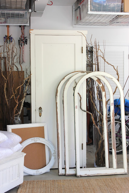
See those arched window frames my friend was selling at our sale
a couple weeks ago?  They were very popular and I had a lot
of inquiries about shipping them to readers all over the country -
sadly, it just wasn't possible.

However, yours truly did grab one of the windows before
we opened the sale.  I knew I wanted a large
inspiration board for my living room/office and thought
that the large arched frame would be perfect.


I know I am breaking all sorts of design rules having a memo board
in my living room, but I love it! Plus, the wall the board is hung on
is not seen from the entry way.  You have to be in the room to actually see it.

This room is full of meaningful things to me and our family - it is a place
I have taken a few risks with it's decorating and has turned into a favorite 
'quiet space' in our home.  My husband takes business calls in here, my kids 
read in this room and I blog and work at my coral desk in the bay window.


Couldn't resist sharing the little photo-bombing dog pic!  Obviously, even
the doggies love this room!

10.12.2012

friday...


I needed to see this...maybe you do too?
Happy Friday!
xo~
10.11.2012

Botanical Study at Ikea....for $19.99!


Botanicals, oh how I love you in every form......
prints, groupings and studies....

Yesterday I was in Ikea - I don't get there often
and truth be told, that is okey dokey with me.  
However, I was downright giddy when I stumbled upon
Ikea's $19.99 botanical study reproduction.
I could totally design a room around this piece -
the colors are gorgeous!

The only negative is that the material is sort of plastic-y but
for $19.99 you just can't go wrong!  I thought long
and hard about where I would hang this in my home
but I came to the sad conclusion that I just don't have
a place for it.


You can a peak in the photo below of the vintage
botanical study I purchased at Farm Chicks in June.
It hangs in a narrow hallway that is hard to photograph
so you are just going to have to deal with seeing 
half of it. sorry.


So run, don't walk, to Ikea to get yours!

10.09.2012

Planks


Horizontal paneling or planks seem to be all the rage in design these day.
The look add architectural interest and works well in both traditional 
and contemporary spaces.


The bookcases in our great room are really a focal point of the room
so I wanted give them some more texture.  I had previously
painted the backs of them in SW Urbane Bronze which was
fine but probably not the right choice for my more traditional
style choices.

I knew I wanted to add horizontal planks to the back of the book shelves but
also knew I wanted it to be a temporary look just in case when I tire of it.

I went to Home Depot and had the friendly orange apron clad gentleman
cut a $11.00 piece of sub-flooring into 4 inch planks the width of my book shelves.
I painted everything BM White Dove to match my trim color and simply
mounted the planks to the backs with .......are you ready?
3M tape!


Is it perfect? 
No.
However, I achieved the look I wanted for very little cost.
I am thrilled with the results.


Happy Tuesday to you all......
It's a miracle I got this post up today - I took
my little girl to the Justin Bieber concert last night
and momma is suffering from Bieber-fever today!
Definitely a LATE night but so fun to share the 
experience with my little daughter! She had
a blast and momma still has ringing in her ears!


10.04.2012

Me...at Design Camp!

Check out AB Chao's blog post about the Portland Design Camp.  There are a couple pictures of yours truly enjoying the day.  {Hint: I am wearing a bright blue shirt}

Thanks to everyone who inquired about our vintage sale tomorrow - I look forward to meeting a few of you!
10.03.2012

One girl's junk.......


.....is another girl's treasure!


I spent my day loading up a friend's garage with all sorts of 
my 'cast-off's' - vintage items that just don't have a place in my 
home any longer.  Two like-minded friends did the same.

We are having a sale on Friday!
And if you are local - that is in the greater Portland, Oregon
area, YOU are invited to come!

Email me at jillbeth@aol.com for directions -
cause I don't believe my friend would appreciate
her addy out here on the internet.....not because
I think you are crazy!


I took photos today as we were setting up.....


Lots of white and chippy.....


Some signs....


And lighting.......


And linens.......


And my sweet bottle drying rack...


And some rusty stuff....


And some cool architectural pieces....


And a random cute bird house.....


This my friend's dog - isn't he adorable?  He's not for sale but I bet
he will welcome any and all tummy scratches!  He even matches the merchandise.


10.01.2012

Monday....Sneak Peek


Happy Monday!

My goal was to post perfectly styled photos of my bookcases
with their newly planked backs...but alas, with SIX
volleyball games and two soccer games and other social
commitments this weekend, my bookcases currently look like this.

See the shelf on the upper right?  Ran out of planks...
Made a Sunday evening run to Home Depot and will
finish today, yes I will.

Be back soon with pretty pictures.
Have a fabulous day.


Follow this blog with bloglovin

Follow on Bloglovin
Related Posts Plugin for WordPress, Blogger...